Second, the color and emotion in packaging design
  Color is the visual information symbol that is most sensitive to visual stimuli and has the fastest response in all visual elements of human body. Japanese scientists have found that people’s attention to color accounts for about 80% of human vision, while attention to shape only accounts for about 20%. Therefore, color plays an important role in packaging design. Colors can be divided into primary colors, intermediate colors, complex colors, and complementary colors. Its three elements include hue, purity, and lightness. Various elements have different attributes and meanings. Hue refers to the appearance characteristics of colors and their differences. The basic hue includes red, orange, yellow, green, cyan, blue, and violet, and their wavelengths are different. The effects on the human retina make people feel different colors, among which the red, orange, and yellow light wavelengths are relatively large. Human vision has a strong impact, while blue, green, and violet light have smaller wavelengths and weaker impact. Hue can reflect the inherent color and warmth of things. Purity is a qualitative indicator of color in terms of quality. Brightness refers to the amount of light that stimulates the human eye. Faced with different colors, people will have different psychological reactions such as cold and warm, light and dark, light and heavy, strong and weak, far and near, and expansion and contraction.
The color design of the product packaging should match the attributes of the product. Color design should enable consumers to think of the characteristics and performance of the product. What needs to be emphasized is that regardless of the color, the basic starting point should be to match the contents of the goods. According to the color of the product packaging, consumers can think of the packaging of goods, such as green can reflect the canned green beans, orange can reflect the orange juice. If this practice is violated, consumers may be misled, which is detrimental to the sale of goods. For example, if a black bottle is used to hold mineral water, it is difficult for consumers to connect from black hole packaging to crystal clear mineral water. In color science, this color, which embodies the attributes of goods, is called the image color. The use of image color should follow the principle of proper and vivid image. In general, the red tone means passion, passionateness, unrestrainedness, and is mostly used in cosmetics and food; the blue tone is calm, cool and calm, and can be used for swimsuits, water sports equipment, cold drinks, summer vests, fans, refrigerators, etc. Hardware machinery and electrical appliances can also give people a fresh feeling. In addition, hospital hygiene supplies can also be used blue tone; Purple tone noble, elegant, mysterious, often used in senior cosmetics, jewelry, gift gifts; yellow tone happy, lively, wealthy For packaging textiles, people will feel warmer. However, it needs to be pointed out that the use of image color is not old-fashioned imprisonment and sticks to conventions. If it can be adapted to local conditions and be flexible and innovative, it may “rebound new ideas†and receive unexpectedly good results. For example, a company uses blue tints to package moon cake foods, so that consumers think of the beauty of the Mid-Autumn Festival, thus sprouting the desire to buy and eat moon cakes.
In the final analysis, product packaging should be able to meet the aesthetic needs of consumers and express the emotional voice of consumers. Only by embodying and inducing the good feelings of the consumers with colors can it stimulate their desire to buy. A market survey in the United Kingdom shows that when a housewife goes shopping in a supermarket, the goods purchased through exquisite packaging are usually more than 45% of the budget, which indicates that the packaging design is very attractive.  
(to be continued)
Silicone Oven Mitt description:
- The Most Popular Silicone oven mitt Available!
-Silicone Over Mitt Protect Your Hands And Avoid Accidents With Insulated Waterproof Five-Fingered Grip
- Heat Resistant For Temperatures Up To 425 Degrees Fahrenheit
- 100% Waterproof, Covers Your Wrist, Keeps Hands Safe and Dry
- Lightweight, Flexible, No Slip Grip Design To Allow Safe Movement Of Hot Items, Easily Grab Carved Hot Juicy Meats
- No Staining or Smell: Even After Long Term Use
- Dishwasher Safe, Easy to Clean
- BPA-Free
- FDA Approved
- 1 Size Fits All
Samll heart shape silicone over mitt can make you smile.
Pliable silicone material makes gripping easy
Top rack dishwasher safe
Great for lifting lids or grabbing teakettle
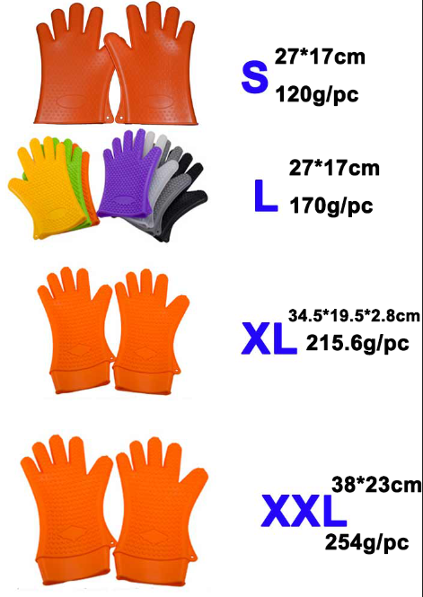
Silicone Oven Mitt Size: Approx. 27 x 17 cm/10.63 x 6.89inch(L x W)
Silicone Oven Mitt Caution: No Cutting, No Burning on mold!
Color: Any color is ok.
Duable, reusable, non-stick, non-toxic.
Microwave and freezer safe. Easy to use and clean.
Suitable for microwave oven, baking and cooking
Material: High Quality Food Grade Silicone.
Compliance with LFGB/FDA/SGS.
Put it on and you can hold those hot dishes that come out of the oven!
But the beauty of this is that it can be hand washed or even dishwashed!
This weighs approx 171 grams
| Item Name: | Silicone oven mitt |
| Size: | 27*17cm |
| Weight: | 171g/pc |
| Material: |
High quality food grade silicone raw material |
| Range of temperature: | -40 to 425 degree |
|
Sample, drawings or pictures with requirement details: |
Are all acceptable |
| OEm/ODM order: | Warmly welcomed |
| A variety of colors and shapes: | Available for sure |
|
|
|
Silicone Oven Mitt Size For Reference:

Silicone Oven Mitt
Silicone Oven Mitt,Cute Oven Mitts,Long Oven Mitts,Funny Oven Mitts
Shenzhen Feiaoda Technology Co.,Ltd , http://www.flysilicone.com